How can you make your sales brochures more effective? How do you write copy that gets your business brochures, pamphlets and marketing flyers read and gets customers to respond? Use these 14 copywriting and brochure design tips to create and improve the sales literature you provide customers.
If you’re planning to create a sales brochure or flyer to drum up business or to announce a new product or service, you’re probably wondering what you can do to ensure a good response.
After all, creating and mailing sales brochures represents a significant marketing expense. And, cost isn’t the only thing you need to worry about. Every piece of literature you send out or hand out leaves an impression on your prospects. Leave the wrong impression, and you run the risk of losing sales and alienating customers.
So, what can you do to make your next sales brochure or marketing flyer a winner? Here are 14 important copy and design tips for successful sales brochures.
1. Understand your customer
Before you spend any time planning or writing brochures, make sure you understand your customer. Why would they want to buy your product? What’s the most important thing it can do for them? What is the most important problem your product or service can solve for them? If you don’t know the answers to questions like these, go ask. Talk to your salespeople. Talk to customers. Use their answers to help decide which benefits to play up in your brochure.
RELATED: How to Identify Your Target Market
2. Plan your brochure for AIDA
No, that’s not your favorite aunt. AIDA is an acronym for Attention, Interest, Desire, and Action. To be effective, your sales brochure needs to get attention, get the prospect interested enough to read further, raise their desire for the product or service, and get them to take a specific action such as buy now, call and make an appointment, visit your website, or return a postcard.
3. Don’t put a picture of your building on the cover of the sales brochure
Sure, you’re proud of the building and the way the company has grown. But your customers really don’t care how proud you are of your company, or how big your building is. You need to design your brochure to show what the customer wants to know — and that’s whether or not your products meet their needs. Don’t waste space you should use to sell your products and convince customers to buy now.
4. Do use images that are important to your customer
Your customer will want to see the product you’re selling or images of the results they’ll get or emotions they’ll feel if they use your product or service. Be sure the images are clear and look professional.
5. Sell, don’t tell
Your customers and prospects aren’t really interested in your company or products. They’re interested in themselves and/or their own businesses. To get their attention, your brochure needs to focus on the benefits they’ll enjoy by making a purchase from you.
Think about it. How many people buy a smartphone because they want to carry a phone around with them all day, or for that matter because they actually plan to use it primarily as a phone? They buy them to stay connected to people and events, to share information with written words and pictures, to find answers to questions in a hurry, and, sometimes, just to show others that they have the latest cool tech device. All of which is why companies that manufacture smartphones and the service provider that make it possible to use the smartphones focus on the fun people derive from taking photos, sharing, collaborating, and getting a big data allowance each month.
Before writing the copy for your business brochure, make a list of the benefits your customers want to attain when they acquire your product or service. Use that list of benefits to help you write customer-focused copy.
6. Use headlines and graphics your audience cares about
The average reader takes less than five seconds to glance at the cover of a sales brochure and decide whether or not to read it. If your headline or graphics on the cover of your brochure are boring, few recipients will bother opening it.
For instance, a photo of people watching a presenter writing on a flip chart above a headline that reads, “Matching People and Strategy,” is likely to get a brochure pitched into the recycle bin. But, a photo showing a businessperson giving a thumbs up sign to small group of associates and a headline that reads “Train Your Team To Land Big Sales” is more likely to get attention.
7. Make your brochure look professional
Even if your brochure is well-written, it won’t get much response if it’s poorly designed. Confusing page layouts, type that’s too big or too small, too many different fonts, or too many different colors of type on a page can all make a brochure — and your business — look unprofessional.
If you’re designing your own brochures, you can give your brochures and flyers a professional look by using free design templates. You can find free brochure templates on Office.com, Template.net, and many online printing sites.
8. Use benefits-oriented headlines inside your brochure
Once you’ve gotten the recipient to open the sales brochure, the next thing they’ll do is skim the headlines inside it. Use these inside headlines to hold their attention and move them through the copy.
9. Use bullet points to focus on the key features of your product or service
Consumers and business people alike are pressed for time and have many ads vying for their attention. So they tend to skim quickly through copy. Feature-rich bullet points will help keep them focused on what you offer and lead them toward the action you want them to take next.
10. Focus on readability
Don’t make it difficult for people to read your brochure. Gray type on a white background and dark type on a dark background are difficult to read. So are pages that have a lot of text and small type. Break up blocks of type with headines and white space.
11. Tell them what you want them to do after reading the copy
After you interest the reader in what you sell, you have to take the next step: tell them what they need to do to acquire it. Don’t just assume they’ll look for your phone number and call or visit your website. If you don’t tell them what action to take, they may take the wrong one — calling another merchant or service provider instead of you.
12. Give them a reason to act now
If you don’t urge the reader to act now, and don’t give them a reason to do so, your efforts in getting attention and building interest and desire will be wasted. The customer will move on to the next thing that catches their attention and forget all about you.
Some of the more common offers to get customers to buy now are special discounts that are only valid before a specific date, a free gift for purchases before a specific date, and rebates for purchase by a specific date. Others that don’t involve discounts or giveaways are reminders to buy now because the quantities are limited (if they really are), or because prices will be increasing, etc.
13. Make it easy to respond
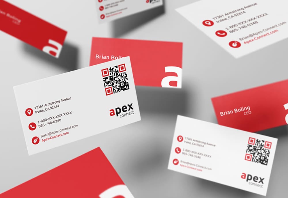
Be sure your business name, phone number, and website url are easily found in the sales brochure or flyer. Add your FaceBook, LinkedIn, Pinterest, and Twitter pages, if you have someone who watches those regularly, too. A QR code that takes people either to your product page or to a page to signup for your newsletter is yet another option to consider.
14. Take away the risk
Once you’ve built up the desire to have what you sell, you could still lose the sale if the customer has any concerns about purchasing from you. To ease the customer’s fear, include a money-back guarantee.
RELATED: 4 Types of Advertising Headlines That Get Attention
State Guides for LLC Formation
Check out our comprehensive guides tailored to each state's LLC formation laws and processes.


